KPIs, or Key Performance Indicators, are a common way to gauge performance against a set of objectives, and are an integral part of performance management.
Without getting too deep in jargon, the fundamental idea behind a KPI is that you are comparing some known measure against a target, and then grading the comparison.
This is a follow up to my post exploring KPIs within Analysis Services. You may want to read that post first as it provides an introduction to KPIs.
I received some feedback from Daniel Otykier (author of Tabular Editor) regarding my last post and it inspired me to dive deeper into how KPIs are handled within Analysis Services, how you can create them using Tabular Editor, as well as their implementation within Power BI.
Great post. I noticed that you can reference any KPI expressions elsewhere in your model, just as if they were another measure: [_Sales Goal], [_Sales Status] and [_Sales Trend] if the base measure is named [Sales]. Also #TabularEditor is great for editing KPIs as well :-)
— Daniel Otykier (@DOtykier) December 28, 2018
Without wasting any time, below are my observations after a further look into KPIs.
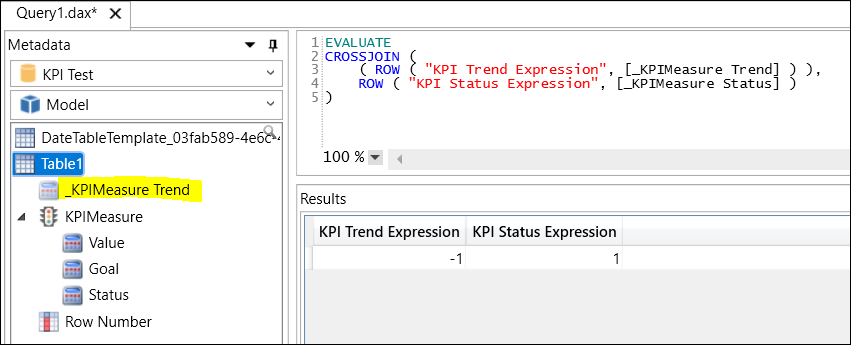
Observation 1: KPIs create “hidden” measures that are able to be referenced in other DAX expressions
Daniel is completely correct in his reply to my tweet above, you can reference the automatically generated hidden measures related to your KPI in other parts of your model as if they were regular measures. They are in the form of [_MeasureName Goal], [_MeasureName Status] and [_MeasureName Trend], just as Daniel described.
Interestingly, DAX Studio currently doesn’t organize the [_MeasureName Trend] measure in the same way as the others with their shortform names (e.g. “Value”, “Goal”, and “Status”).
Note that in SSDT the “hidden” KPI measures will appear with a red squiggly line underneath them, indicating that SSDT does not recognize the measures, however, they should still evaluate correctly.
Observation 2: StatusExpression and TrendExpression can both be created in Tabular Editor and they should evaluate to a number corresponding with their StatusGraphic and TrendGraphic
Currently when developing KPIs in SSDT the StatusExpression is created automatically when you use the KPI dialog. Note, you are not able to create a TrendExpression through the SSDT KPI dialog and there are no hints that the property even exists.
On the other hand, creating the StatusExpression and TrendExpression is possible in Tabular Editor for both Analysis Services Tabular and Power BI data models. _You might be able to create a TrendExpression for a Power Pivot model within Excel, however you can’t connect to it within Tabular Editor so I haven’t looked any furthe_r.
Because you are able to edit the expressions in Tabular Editor, you can create them in whichever form you’d like, although they should always evaluate to either [-2, -1, 0, 1, 2] for a 5 icon set, or [-1, 0, 1] for a 3 icon set for Power BI.
Below is an example for how you might accomplish a TrendExpression for your sales vs prior period sales. You can also achieve something similar using PARALLELPERIOD, however I’ll leave this up to you!
Sales KPI :=
IF ( [Sales Prior Period] = 0, BLANK (), [Sales] )
Sales Prior Period :=
VAR LastYear =
    CALCULATE (
        [Sales],
        FILTER ( ALL ( 'Date' ), 'Date'[Year] = MAX ( 'Date'[Year] ) - 1 )
    )
VAR LastQuarter =
    CALCULATE (
        [Sales],
        FILTER (
            ALL ( 'Date' ),
            'Date'[QuarterIndex]
                = MAX ( 'Date'[QuarterIndex] ) - 1
        )
    )
VAR LastMonth =
    CALCULATE (
        [Sales],
        FILTER ( ALL ( 'Date' ), 'Date'[MonthIndex] = MAX ( 'Date'[MonthIndex] ) - 1 )
    )
VAR LastWeek =
    CALCULATE (
        [Sales],
        FILTER ( ALL ( 'Date' ), 'Date'[WeekIndex] = MAX ( 'Date'[WeekIndex] ) - 1 )
    )
RETURN
    IF (
        ISFILTERED ( 'Date'[Week] ),
        LastWeek,
        IF (
            ISFILTERED ( 'Date'[Month] ),
            LastMonth,
            IF (
                ISFILTERED ( 'Date'[Quarter] ),
                LastQuarter,
                IF ( ISFILTERED ( 'Date'[Year] ), LastYear, BLANK () )
            )
        )
    )
TrendExpression :=
VAR x = [Sales KPI] / [Sales Prior Period]
RETURN
    IF ( ISBLANK ( x ), BLANK (), IF ( x < 0.9, -1, IF ( x < 1.1, 0, 1 ) ) )
The above TrendExpression can be interpreted as a downwards trend if sales are down more than 10% over the prior period; stable if between -10% and +10% over the prior period; and upwards if over 10% from the prior period.
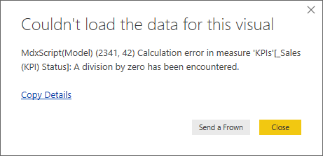
Note that when I create the base KPI measure I will usually make a minor adjustment to check for whether the target KPI measure is 0 to avoid divide by 0 errors.
Observation 3: Icon sets are based on the implementation within the reporting tool, and there is no universal standard for the graphic string identifiers
What I mean by this is that each reporting tool decides on their own implementation of how they will interpret the values (e.g. -1, 0, and 1) received from the StatusExpression and TrendExpression.
Each client will then view the StatusGraphic [or TrendGraphic] string supplied by the KPI metadata, and if that string corresponds with an icon set, it will substitute the StatusExpression values for the corresponding icons.
From the Analysis Services protocol: “Because TrendGraphic [and StatusGraphic] is a string property, each client can define and use its own specific set of known values”.
The below table shows the graphic strings/icon sets I have found and their interpretations in Excel and Power BI. This is not an exhaustive list, feel free to tell me any you have found and I will update this post.
Below is the same list as included in the image above:
- Cylinder
- Faces
- Five Bars Colored
- Five Boxes Colored
- Gauge
- Gauge - Ascending
- Gauge - Descending
- Reversed Gauge
- Reversed status arrow
- Road Signs
- Road Signs
- Shapes
- Shapes
- Smiley
- Smiley Face
- Standard Arrow
- Status Arrow
- Thermometer
- Three Triangles
- Three Circles Colored
- Three Flags Colored
- Three Stars Colored
- Three Symbols Uncircled Colored
- Traffic Light
- Traffic Light - Single
- Variance Arrow
- Status Arrow - Ascending
- Status Arrow - Descending
Some notes about my testing
- I did not test other client tools such as SSRS.
- In both Excel and Power BI, all graphics are the same for StatusGraphic and TrendGraphic.
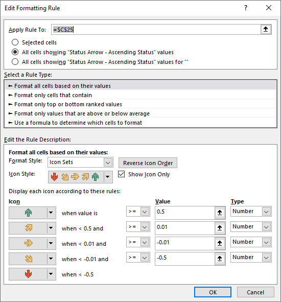
- Excel inserts an icon-set conditional-format on top of the status number. This can be customized to whatever set of symbols/thresholds you want within the conditional formatting dialog.
- Power BI strictly converts the StatusExpression results from -2,-1,0,1,2 to an icon set.
- Excel uses a range to convert the StatusExpression results [for 5 levels]:
- Level 1: x <-0.5
- Level 2: -0.5 <= x < -0.01
- Level 3: -0.01 <= x < 0.01
- Level 4: 0.01 <= x < 0.5
- Level 5: 0.5 <= x
- Excel uses a range to convert the StatusExpression results [for 3 levels]:
- Level 1: x <-0.5
- Level 2: -0.5 <= x < 0.5
- Level 3: 0.5 <= x
- Excel appears to default to red/yellow/green circles for strings it doesn’t recognize, whereas Power BI defaults to showing the status number.
Tips for developing KPIs in Tabular Editor (updated 3/1/2019)
- Create a new measure for your KPI that will evaluate to BLANK if the goal measure is blank or 0.
- If your goal measure evaluates to 0 (e.g. you have a goal to have 0 workplace injuries), use a “static” goal when creating your StatusExpression.
- Make your StatusExpression and TrendExpression evaluate to the correct number of icons as per the StatusGraphic/TrendGraphic you select. E.g. if you are using a 5-icon set, evaluate to -2,-1,0,1, or 2. If using 3-icon set, evaluate to -1,0, or 1.
- When using a 5-icon set and Excel, adjust the conditional format (within Excel) thresholds on the Status/Trend cells to be -2,-1,0, and 1.
- When adding measures in Power BI using Tabular Editor, don’t forget to delete the automatically generated Translated Name (as Power BI does not support this).
KPIs and their future implementation within Power BI
Knowing what we now do, I’m hoping that KPIs can be created natively within Power BI Desktop in the future, hopefully in the same implementation style as Excel.
There is clearly a demand for it based on the Power BI ideas request here, most likely it is an issue of technical difficulty versus the payoff.
My suggestion would be to implement it the same way as in Excel (although I understand there are technical difficulties and possibly even better ways to implement it!):
- Include a default icon set for unrecognized strings;
- Use a range rather than static values;
- Allow the icon set to be changed/customized within PBI.
Finally, I hope that @DOtykier might read this and update the Status Graphic and Trend Graphic property dropdowns to include the examples above that work! 🙏
And that’s it! I hope you found this post useful. Feel free to let me know any comments you may have.